CSS RGB/CMYK Channel Splitting
Channel splitting is a glitchy effect usually seen in videos or for text overlays that have an intentionally erronous look about them. In this post we're going to implement some of them with CSS, also as animated effects.
As a bit of a history lesson: old analog monitors (CRT, pre LCD/LED) used to refresh per channel and luminosity (freaky times) and some glitches, mis-configuration or just tear on the monitors would cause the channels to appear offset, so you'd see the picture, but all the yellows would appear slightly off center in any direction. The effect is also called RGB split, channel offset and a couple of other terms that various tutorial channels probably invented themselves.
When it comes to text, you can easily mimic that effect with text-shadow or rather, a couple of text shadows.
But Jonathan! Isn't this modern CSS stuff not at all supported by browsers?
It's 2019, you can safely use text-shadow.
Here's the interactive example:
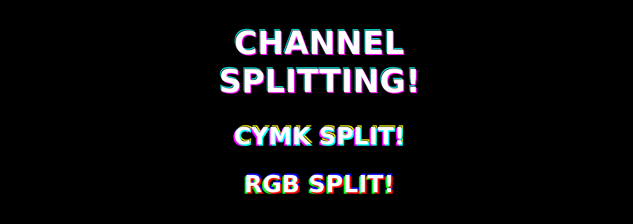
Let's get started and look at a couple of variations, obviously we look at some two and three colour splits, if you're just interested in the classical RGB split, scroll to the end below.
Neon or CMYK Channel Split in CSS
The easiest way to get started with text-shadow is just to define one text shadow. This will create an outline with a defined colour and you can specify the offset into the X and Y direction, the blur effect strength and the colour.
.first-shadow {
  text-shadow: 2px 2px 0px rgba(255, 0, 255, 1);
}
You can have multiple text-shadowss in CSS by just chaining them, separated by commas:
.neon {
  text-shadow: 2px 2px 0px rgba(255, 0, 255, 1), -1px -1px 0px rgba(0, 0, 0, 1),
    -2px -3px 0px rgba(0, 255, 255, 1);
}
For the CMYK we're mixing in a bit of a black outline (the K) to make the white text more visible:
.cmyk {
  text-shadow: 3px 3px 0px rgba(0, 255, 255, 1), -3px 3px 0px rgba(255, 0, 255, 1),
    1px -1px 0px rgba(0, 0, 0, 1), 3px -3px 0px rgba(255, 255, 0, 1);
}
RGB Channel Split as a CSS animation (without fade)
For the CSS animation we want a hard transition from state to state, where we just rotate the colours (if you invest more time than me, yours will probably look a lot cooler too), but the important part is that we leave as little time as possible for the transition state. This means we'll have a specific state as the initial and 99% state, keep that until 32% and then first change it at 33%, which will lead to a hard swap with little transition time.
If you omit this and just set the stops or from and to your css animation will spend its entire animation time fading between the two. This type of CSS animation without transition is similar to setting your keyframes in After Effects and changing a property from one frame to another instead of having an easing or any smooth effect.
@keyframes rgb {
  32% {
    text-shadow: 3px 3px 0px rgba(255, 0, 0, 1), -3px 3px 0px rgba(0, 255, 0, 1),
      3px -3px 0px rgba(0, 0, 255, 1);
  }

  33% {
    text-shadow: 3px 3px 0px rgba(0, 255, 0, 1), -3px 3px 0px rgba(0, 0, 255, 1),
      3px -3px 0px rgba(255, 0, 0, 1);
  }
That's it, there's no more magic to it. If you want to blend your glitchy effect perfectly into your existing site, try playing with the animations steps, bold fonts, opacity or randomly generating the channel offsets, which will give you more cinematic results than the examples here ;)
Full code on codepen: https://codepen.io/jonathanmh/pen/orJozZ
Happy coding out there, frontend warriors!