Why I Love: Radar Charts
Visualising data so it's easy to grasp is one of the big challenges we're facing at a global scale. There's lots of data, but often the presentation is wanting. Newspapers and other publications have employed teams to present infographic like widgets to back up their stories in both digital and print.
Loving is a strong word, but it's fitting. We deal with data all the time and the mainstream media coverage of how data is presented, frequently doesn't go beyond displaying a circle chart of who would have voted for a specific party on the upcoming election.
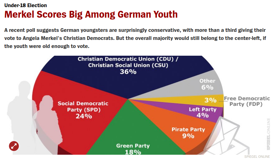
A screenshot from Spiegel, a German print and online magazine.
Other charts we often see, show stock/cryptocurrency prices. They're often line charts that paint the path of a certain value over time. They're also so mainstream that both line and bar charts have made it into several pictograms that have become the icon for any use of remotely statistical accumulation.
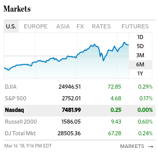
A screenshot from the wall street journal.
One of my personal favourites in charts is the radar chart. It makes it easy to reflect on data that shows preferences or attributes.
I first got in touch with these charts when I was about 8 or 9 when I got a collection book for my favourite Nintendo Gameboy game at the time: Pokémon. It had detailed illustrations of each catch-able little monster and a radar chart showing the different qualities:
- Strength
- Initiative
- Stamina
or something of the like.
You could easily determine if the base points of one creature were superior compared to another, simply by looking at the points briefly.
I didn't know what that it was called a radar chart at this point or that I would ever need it for anything else than comparing characters in a video game. In recent years I have been growing more fond of the radar charts, since they're handy when comparing data. They don't work well over time, but for different, possibly even opposite extremes, you can visualise data a lot more intuitively than by picking a bar chart or something similar.
When you have different personality traits (big five personality traits) for example, you can compare two individuals or even compare one persons self-perception to the perception of a group. Radar charts enable you to see the whole picture and not look at the different traits one by one, like you would have to in a bar chart.
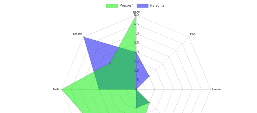
Another comparison you can make is a taste in music, where you even can arrange the points to reflect their likeness or similarity in genre. Please forgive my lack of scienticity on the below examples and a venn-diagram style comparison of two peoples preference in music, scored from 1 to 5:
the bar chart variantSee the Pen bar charts by Jonathan M. Hethey (@jonathanmh) on CodePen.
the radar chart variantSee the Pen radar charts by Jonathan M. Hethey (@jonathanmh) on CodePen.
Which of the two do you find easier to understand?
For me, if I had to pick music for a party, I'd probably go with the radar chart, because it produces a venn like intersection and I can look for the largest surface first and then follow the lines to the outer edge and see which type of music would be preferred amonst multiple people.