Spiderman: Into the Spiderverse; Visual Style Mashup Deluxe
This post is about why Into the Spiderverse looks fantastic, for that I've taken some screenshots of the official trailers at intothespiderverse.movie to illustrate what I'm talking about.
The vibe I got from the trailers was that it'd be a similar movie to Big Hero 6 and I wasn't disappointed. Into the Spiderverse is a great animated movie that does not take itself too seriously, has a fine story for the first of a potential series and is visually stunning.
It's a PG movie (meaning no actual age restriction) so you can see it as a kids movie, but if you've seen any of the spider man stuff, especially the Toby Maguire ones, there'll be stuff to laugh about.
Anyways, the story in a super hero movie isn't exactly what you're going for, but how the characters are going to overcome their challange and what funny stuff they say along the way.
The Visuals
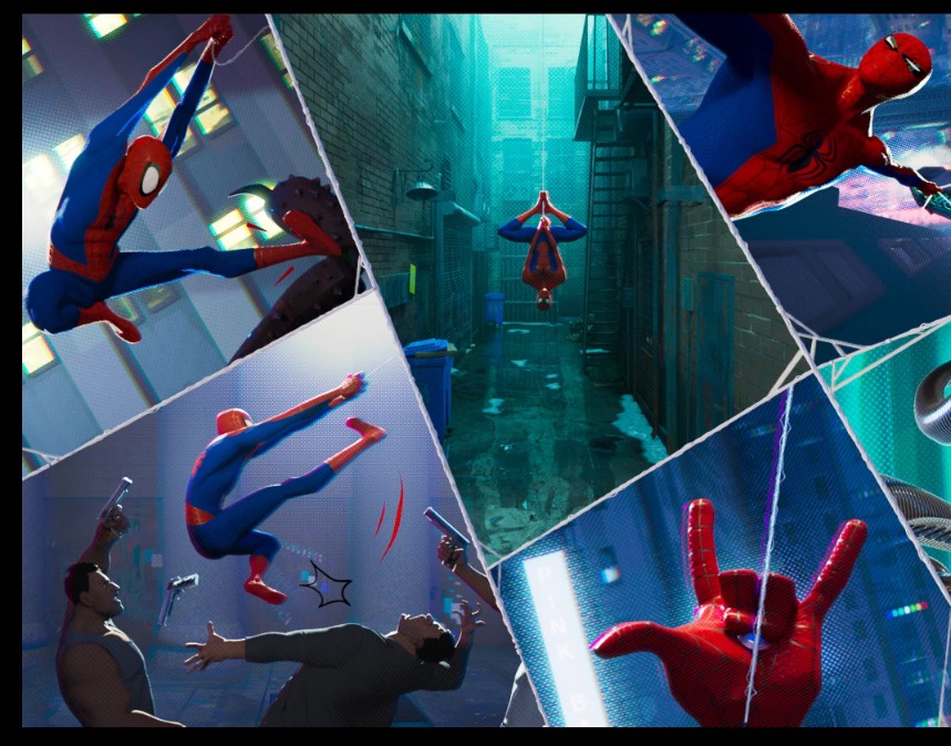
The graphical style and combination of the movie pretty much blew me away. It's a glitchy combination of:
- relatively realistic 3D
- old school comic looks
- some anime elements
and a lot of street art style aesthetics come up in one way or another.
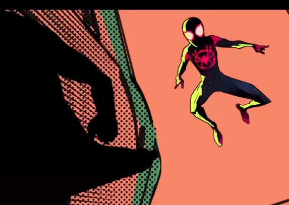
Generally the movie is in the 3D look, sometimes cutting over to the comic style for just a few frames, that are probably accurately enough grabbed from the comics to compete with Sin City on that one:
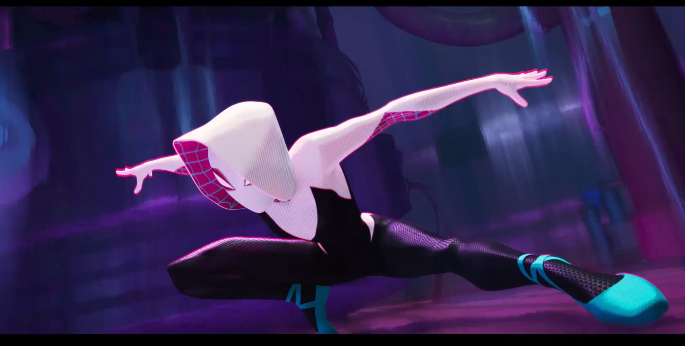
the most common 3D style
Notice the halftones that pretty frequently are used for varying effects, mostly to actually define brightness gradients of areas.
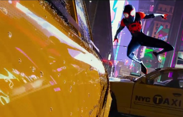
The composition with the split frame that has things happening in sequence was great as well, because it compresses a flashback or a scene where something expected happens in an entertaining way:
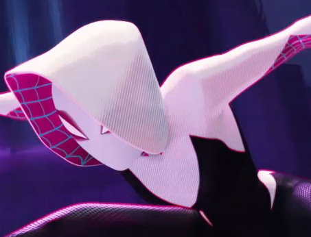
Next up is one of my favourite things, the channel splitting, which was actually sometimes used as a way of focusing. We watched the movie in 2D (because preference) but the channels are still split harder further away from the center or used in some action scenes:
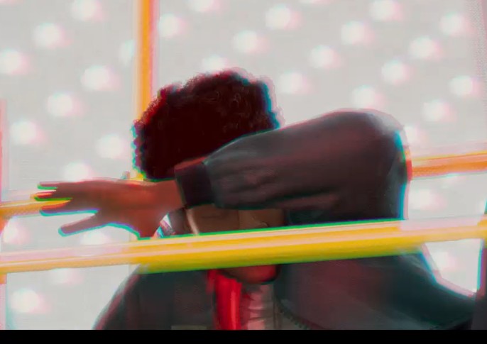
Notice the blue and reds splitting away from the hand.
Lastly, the hatching was a welcome comic relic, which also was used to shade and shadow areas:
and this all is just what I noticed. I hope nobody from the studio reads this, because I probably missed a ton of things, but this was really different and really, really awesome.
9/10 would watch again!
Let me know what you thought about it if you've seen it!