Serif vs Sans Serif for body text
Creating the web and involving the least bit of typography, we have to face the question which fonts we will use, in which combination and sooner or later the serif vs sans serif question is going to come up.
Recently when I presented this page to my fellow students, I received some feedback, which I'm very thankful for, but one point struck me. Freely quoted:
There is a problem with the font, it 's not suitable for the website theme and most of all, it's a serif font, which works better on print. Serif fonts are a bit tiring for the eyes in the web, So we use sans-serif as much as we can. My concern about this is, that it's entirely theoretical, not quite going into detail on the specific case and inspecting the readability.
Uses of Serif Fonts in body texts
I've been reading up on some more famous people using and writing about serif fonts on the web and I would like to propose some examples here.
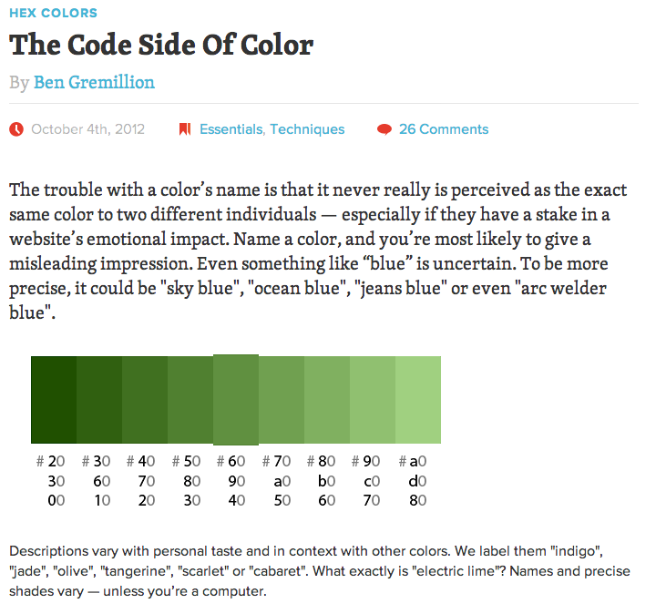
The Smashing Magazine
The headlines and the summaries on the smashing magazine are written in serif and in my opinion, it's pretty damn readable. Again, here the user experience and typography gods of this site have decided to use sans-serif in their body text, which of course is a good choice for long reads.
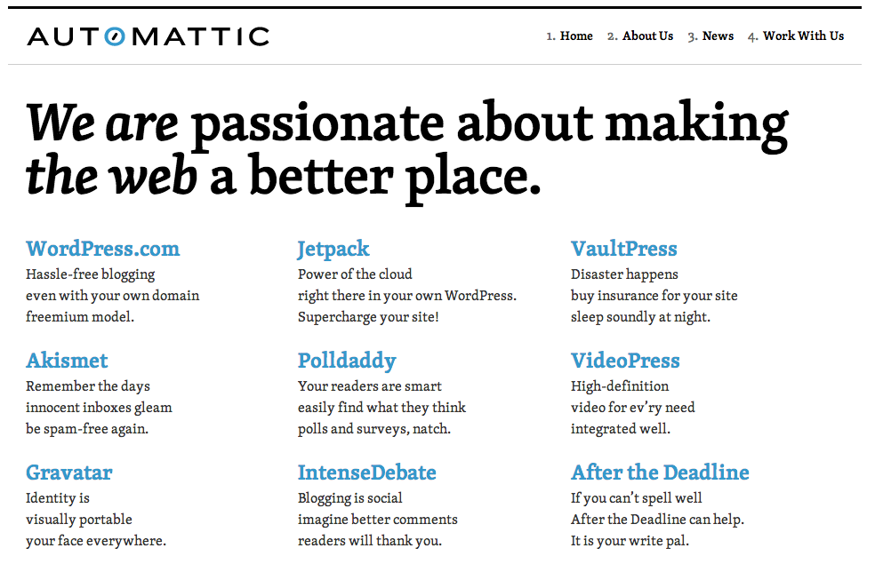
Serifs from Autmattic
So as you can see, the guys from Automattic have some pretty big projects going on and also a lot of experience with writing on their hands, yet again, they chose a serif font. Also a nice example for a smaller font size and use in body text is their work with us page. However, on their about us page they use sans again, my assumption is, because they have a font-size that does not really work with serifs. My point again: If you can make it readable, and it fits your company profile and design, why not use serif?
Further Reading
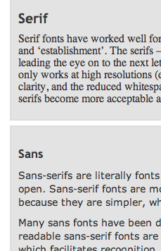
 On webdesignfromscratch I found an article that shows an example of serif vs sans, which is very misleading. It's just a bad comparison, with unequal parts and identical styling. If you want a font to appear as you intend it, of course you apply the individually crafted and tweaked styling and not the one you would use for another font. Apart from this example though, the article has some good advice for beginners in typography and of course, the principles remain valid on the web.
What do you think about serif fonts?
Do you think they represent a real choice in the web of today or are they just annoying you and make you wish, that the designer would just let you read the plain, easy sans version of the text you're looking at right now? What are your experiences with fonts on the web and do you find the typography on this page hard to read?

